The History Makers
( Responsibility )
Website Design
Design System
Social Template
Branding
Website Design
Design System
Social Template
Branding
( Collaboration )
Creative Technician
Founder & President
Consulting Archivist
Maintenance Supervisor
Creative Technician
Founder & President
Consulting Archivist
Maintenance Supervisor
( Period )
2021.12 - 2022.03
2021.12 - 2022.03

( Our mission )
We believe better design with user-centered solutions cans are key to enhancing the communication between products and their users.
We believe better design with user-centered solutions cans are key to enhancing the communication between products and their users.
We can create more intuitive, engaging experiences that bridge the gap between functionality and user interaction.
( User & Client Insight )
Divers age group and computer setting of users.
Large amount of contents including old, pixelated images and videos.
Most website visitors are academic users, spanning a wide age range from students to professors. This user base includes individuals on older devices or with outdated software versions, which requires design solutions that prioritize accessibility and compatibility across diverse platforms.
The client’s digital archive is one of the largest and oldesr collections dedicated to African American history, featuring an extensive array of written materials and interview footage. Due to the age of some footage, there are occasional inconsistencies in content quality, presenting unique challenges for maintaining a cohesive digital experience.
( Problem )
1. Visual hierarchy
2. Unfriendly CTA on Intro
3. Accessibility issue
4. Footage flexibility
5. Inconsistent branding
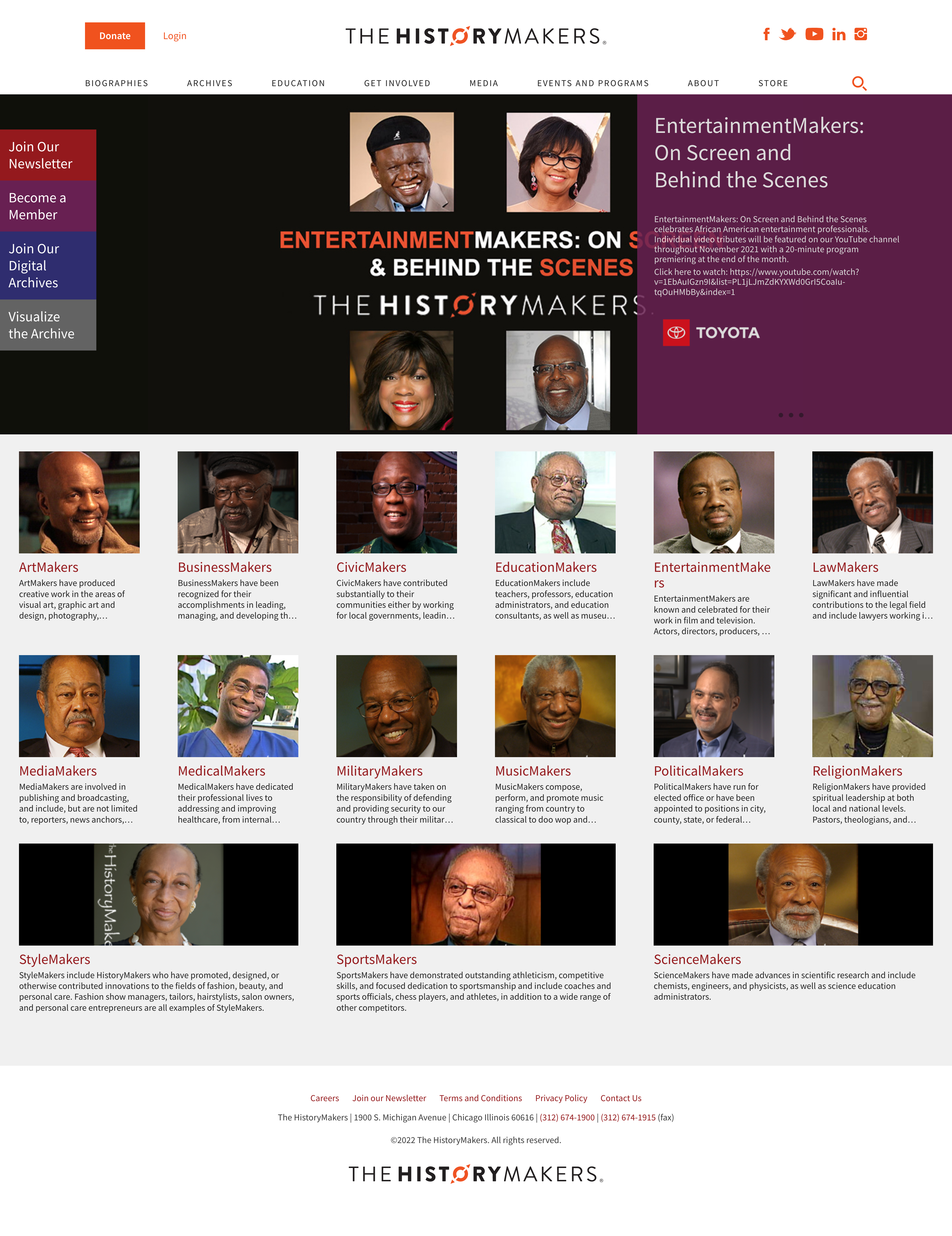
Previously, the client’s product employed an overabundance of saturated colors, which disrupted the visual hierarchy and detracted from the user experience. While the client aimed to increase user engagement, specifically through Newsletter and Digital archive, the current unfriendly CTA - embedded in the intro section without a proper context- fails to encourage users. The outdated single-column layout overwhelmed users, making navigation difficult. From a branding perspective, The History Makers’ inconsistent color system across different platforms hinders users from recognizing The History Makers as one organization.
(Previous website overview)

( Solution )
1. Create flexible and adaptable visual solutions for the website
2. Re-structure the website information architecture
3. Improve accessibility issue
1. Previously, the client used photo images as icons. However, due to the low resolution of many archival images, relying heavily on photos isn't ideal for representing their footage collection effectively.
2. The site information architecture was unclear and some important features like ‘digital archive’ were hard to find.
3. Important CTAs were hard to find.
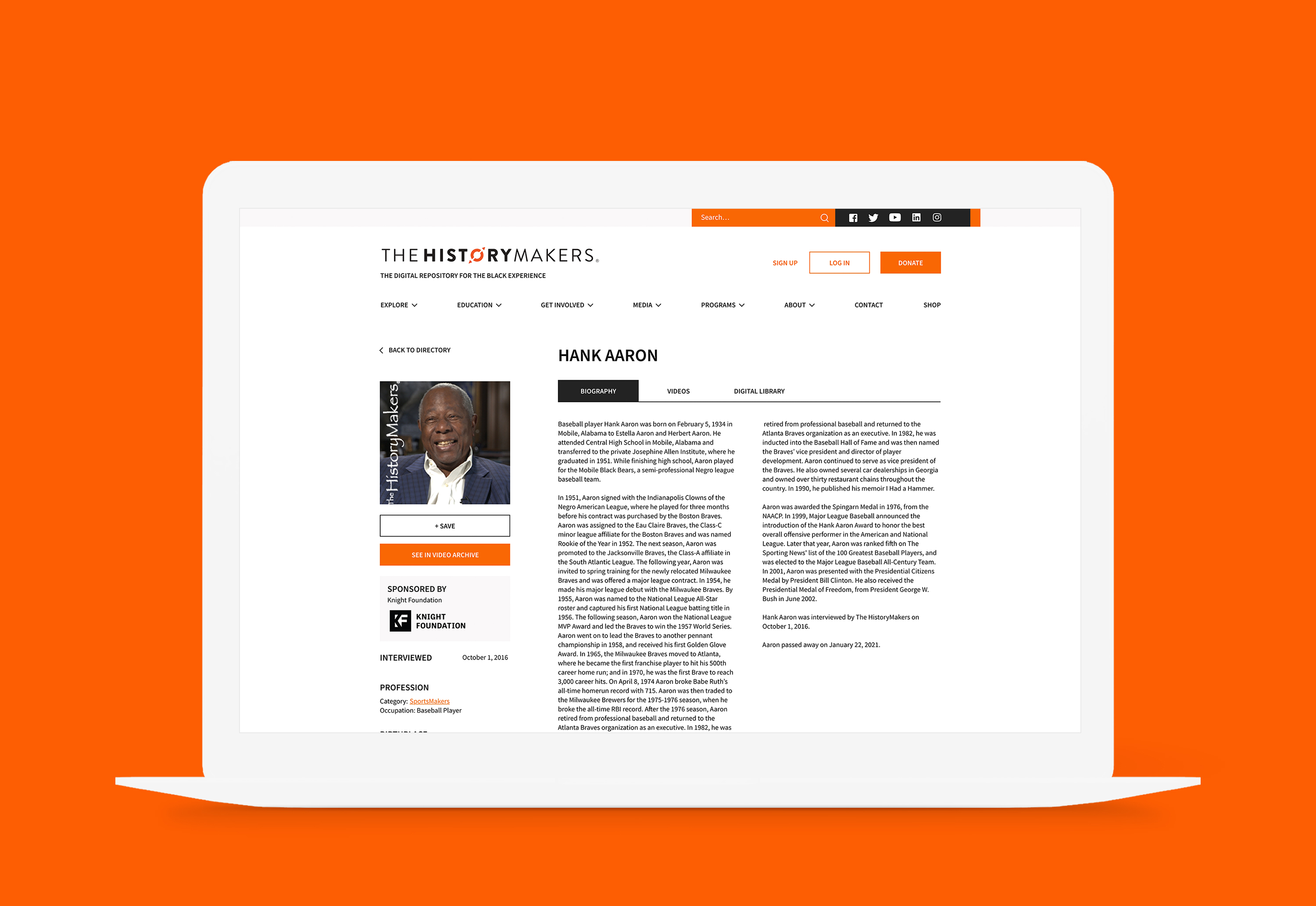
( New design )

