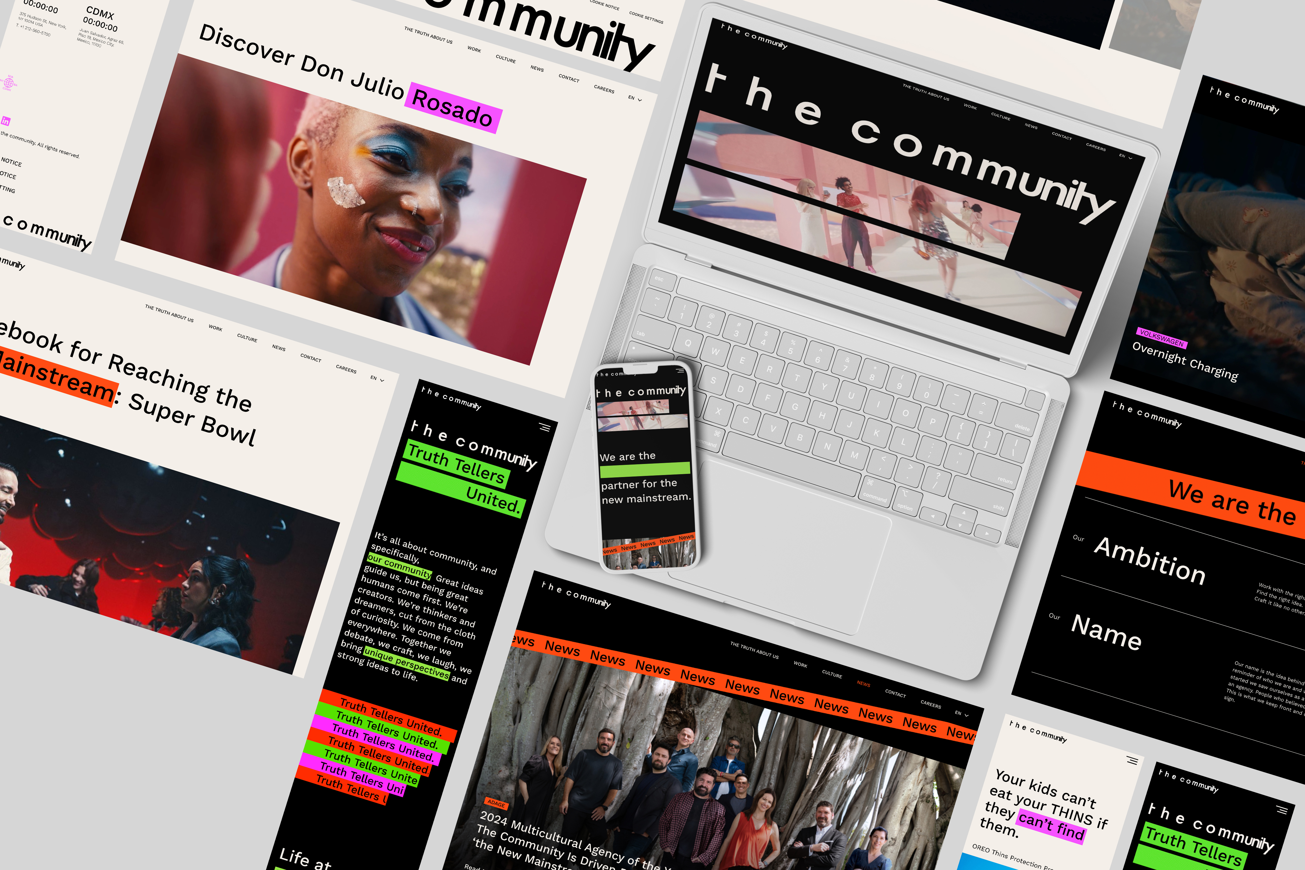
The Community Website
( Responsibility )
Infromation Architecture
Web Design
Design System
Mobile UI Design
Motion Graphic
Infromation Architecture
Web Design
Design System
Mobile UI Design
Motion Graphic
( Collaboration )
Art Director
Creative Technician/Developer
Chief Creative Officer
Creative Resource Manager
VP of Communication
Chief Executive Officer
Art Director
Creative Technician/Developer
Chief Creative Officer
Creative Resource Manager
VP of Communication
Chief Executive Officer
( Period )
2023.12 - 2024.05
(in development for launching)
2023.12 - 2024.05
(in development for launching)
( Why we need this?)
Users need a responsive website that flawlessly adapts between mobile and desktop, with an engaging narrative and visuals, as it reflects the agency’s design capabilities in growing mobile accessibility.

( Branding Statement )
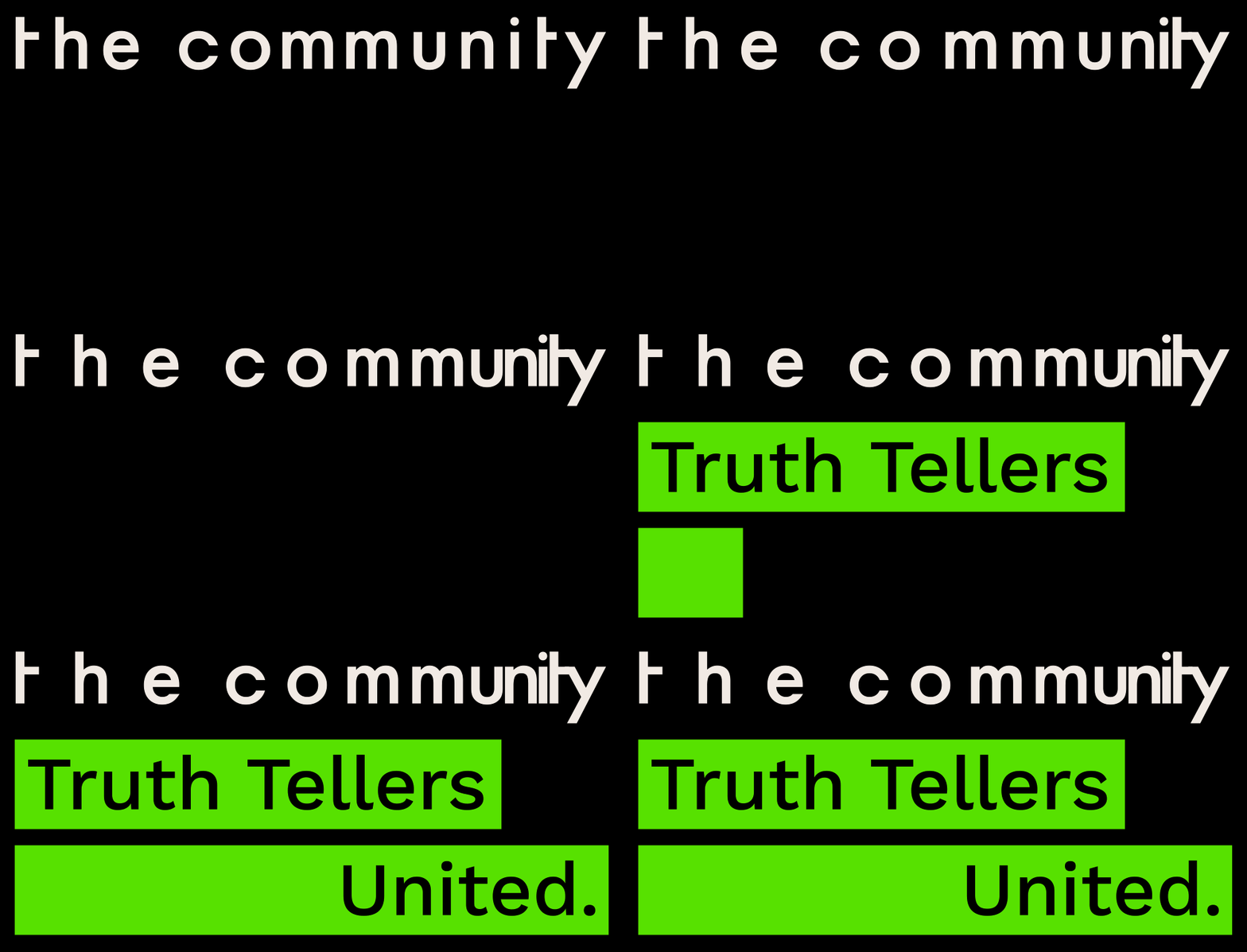
When the mainstream screams lies, we screen to the truth even louder. Highlight the truth.
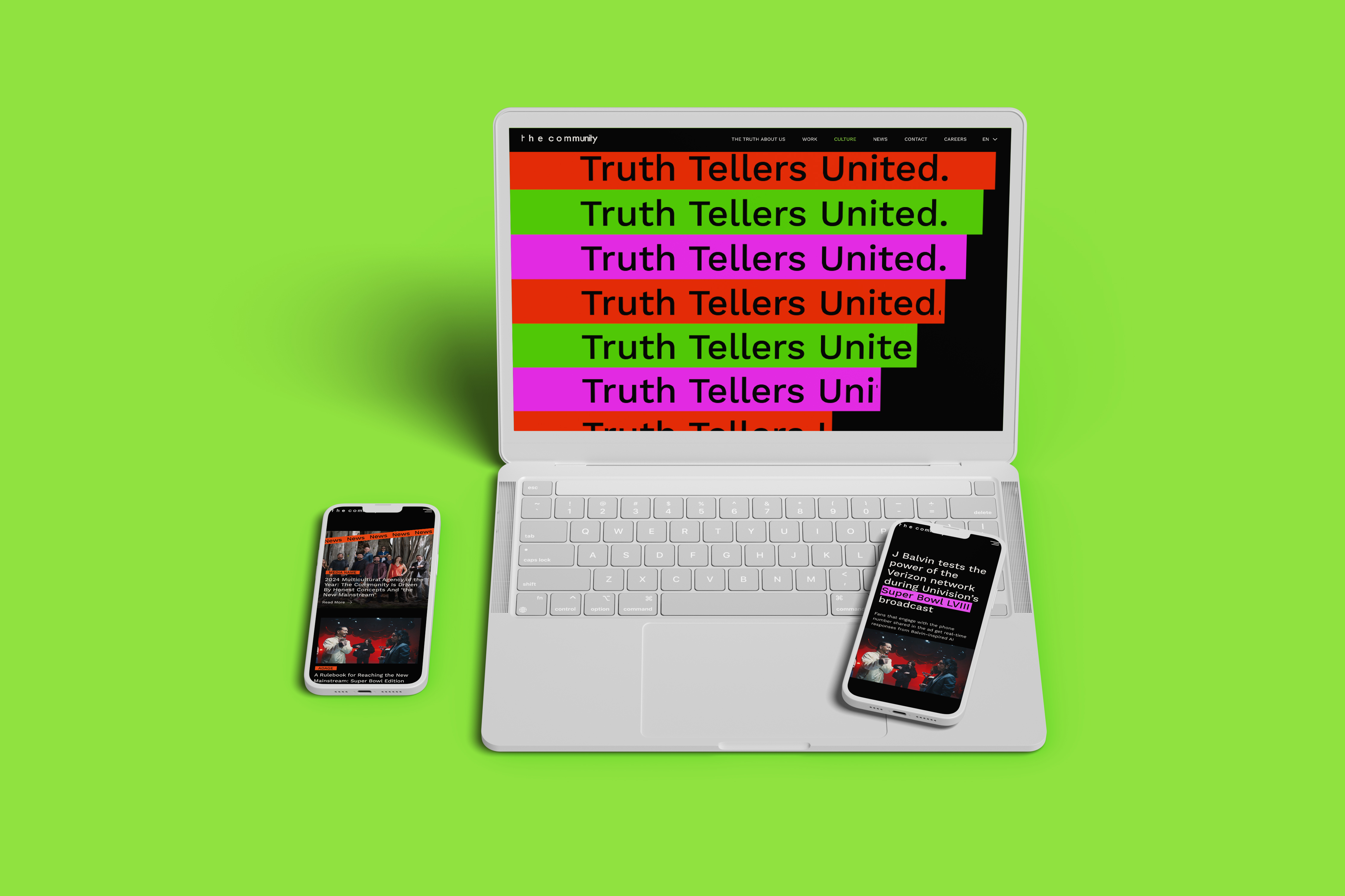
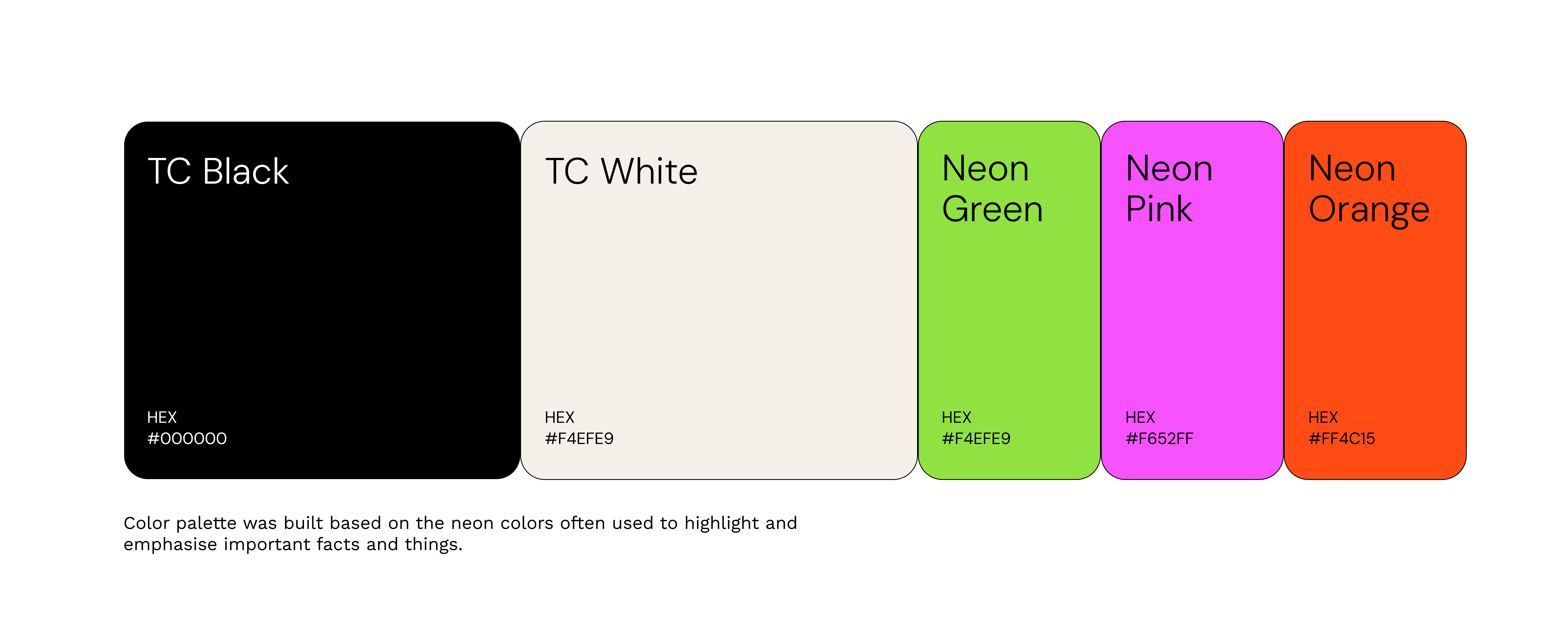
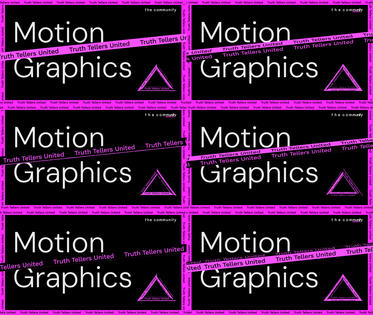
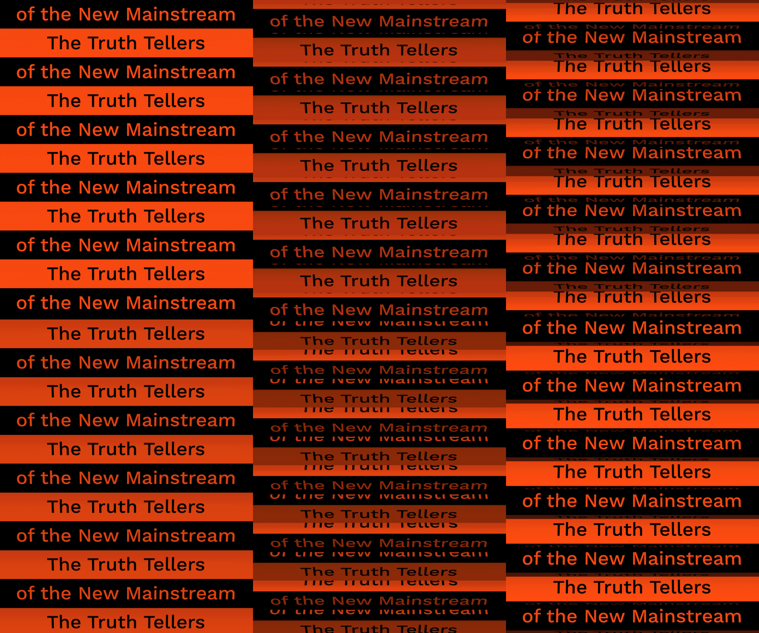
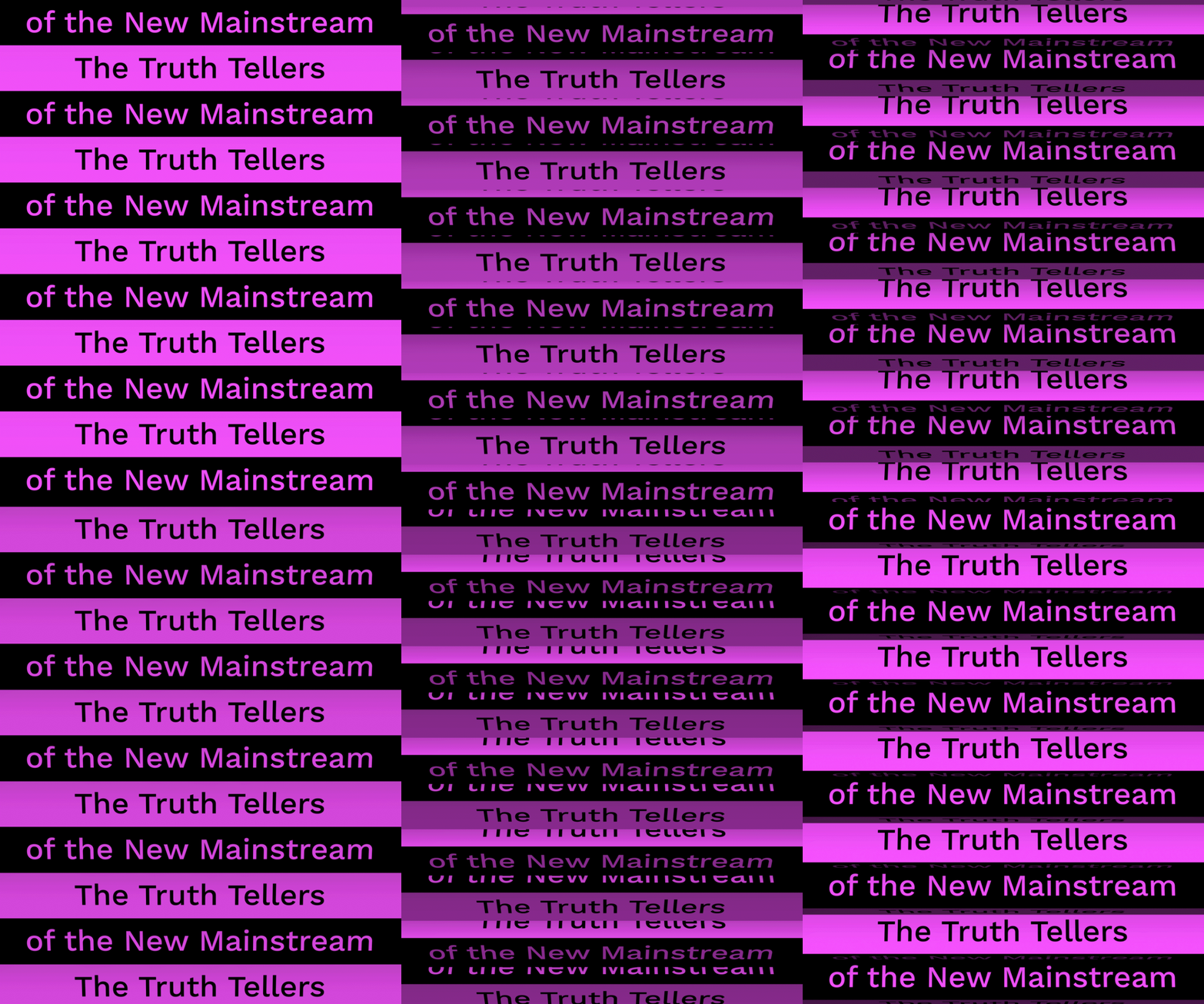
Following extensive research and brainstorming, we chose highlighters as the central symbol for the new brand identity. Highlighters emphasize what matters most—here, that’s truth. Drawing from this concept, we crafted a vibrant color palette and dynamic motion graphics to visually underscore our commitment to spotlighting truth.

( Problem )
1. Poor Accessibility
2. Lack of Visual Appeal
Users struggle to distinguish between different types of information because the website relies heavily on repetitive components.
The website is not visually appealing enough for an advertising agency because of its outdated layout.
( Solution 01 )
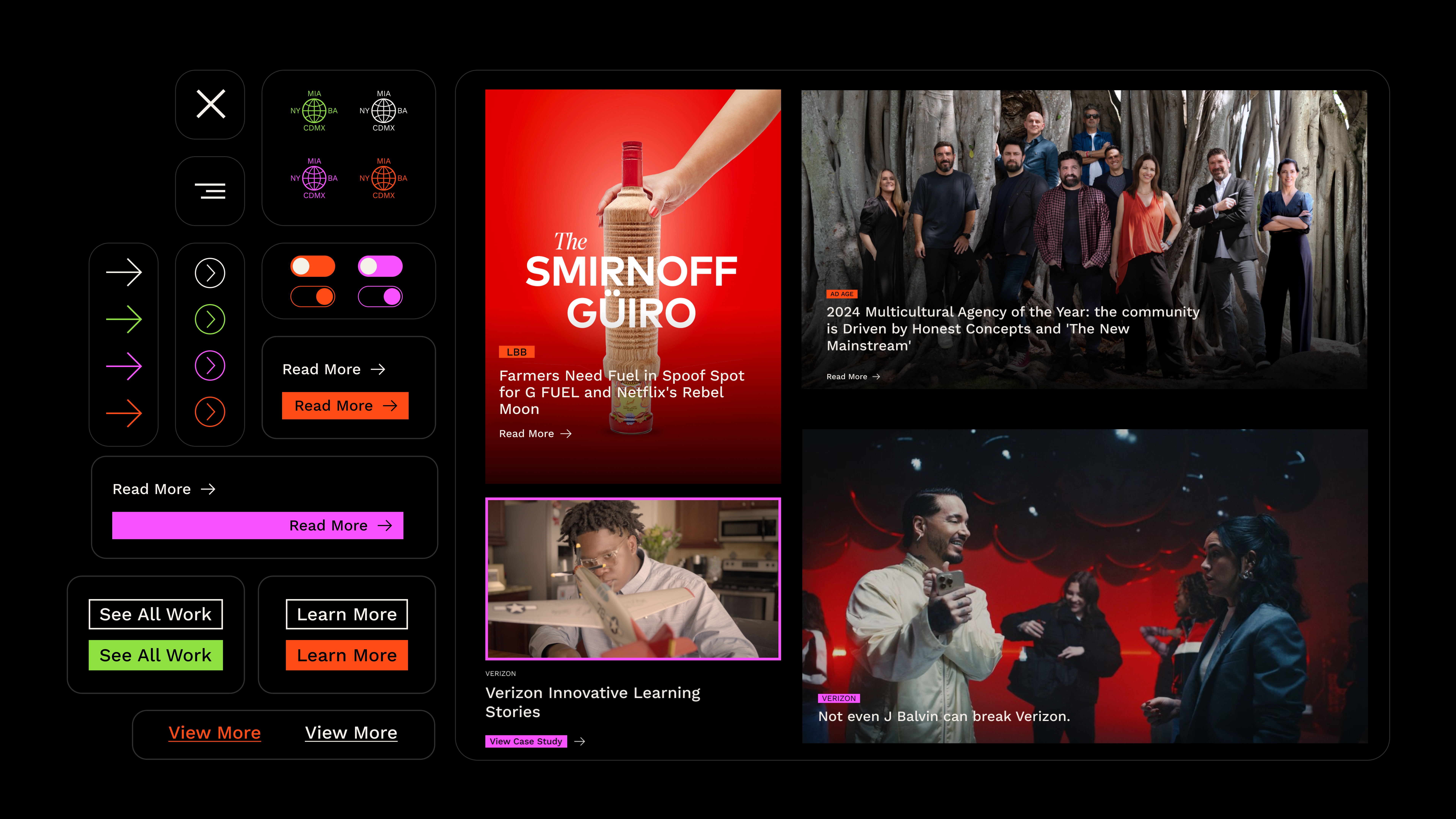
Assist users with well-defined UI elements and accessibility test through an agile QA process.
We aim to design distinct components with clear purposes, helping users visually differentiate between them. To ensure sustainable website management post-launch, I recommended developing a design system with concise guidelines for adaptable use across various scenarios.

Readability is a key for detail pages.
After the design system, we did a brief usability test with prototypes and held a QA session with an engineer and content manager. The main issue identified was text readability on a black background for detail pages. To address this, we set the default light mode for text-heavy pages. Through further testing, we refined Neon Green, Neon Pink, and Neon Orange which perform well in both dark and light modes. Feedback from the team allowed us to fine-tune these details, enhancing accessibility for a diverse user base.


( Solution 02 )
Establish a connection and inspire the user
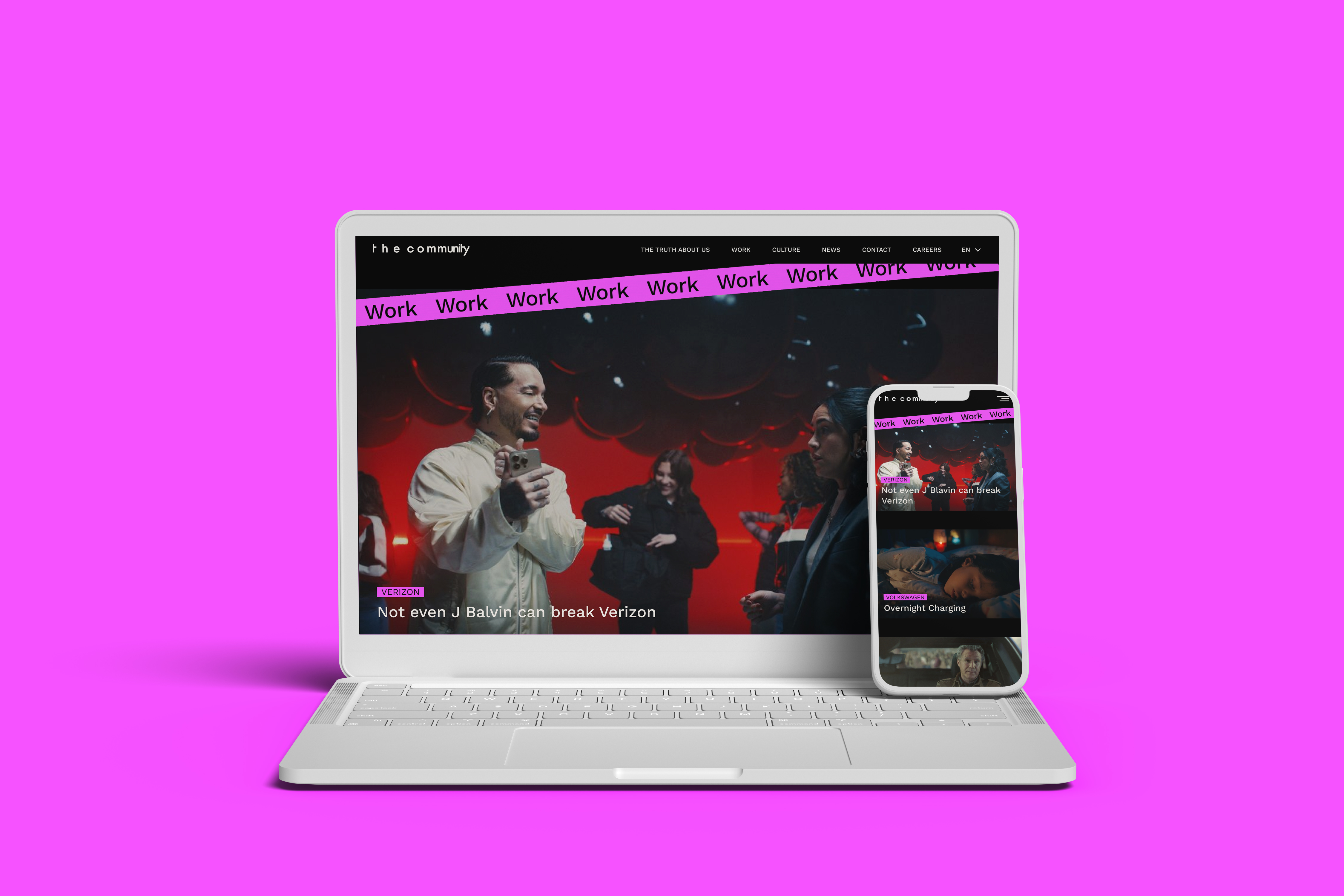
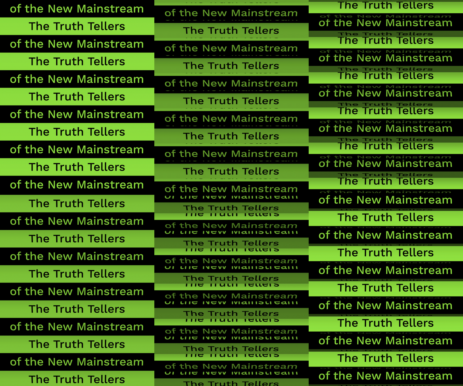
The Community’s strength as a creative advertising agency lies in its diverse portfolio of award-winning work across various clients, supported by a dedicated design studio that creates high-quality assets for both clients and the agency itself. During this phase, I integrated motion graphic elements extensively throughout the website to enhance engagement and visual appeal.


Project Overview

