Doordash User Account
( Responsibility )
User Research
UX Case Study
Mobile UI Design
Prototype
Motion Design
User Research
UX Case Study
Mobile UI Design
Prototype
Motion Design
( Period )
2023.01 - 2023.04
2023.01 - 2023.04
( Why we need this? )
We believe that prioritizing users with specific dietary needs can provide efficient communication between users and restaurants, reducing the risk of allergic reactions and enhancing safety and satisfaction in takeout and delivery services.
We believe that prioritizing users with specific dietary needs can provide efficient communication between users and restaurants, reducing the risk of allergic reactions and enhancing safety and satisfaction in takeout and delivery services.
( User research )
There’s growing number of users who are in special diet and have allergies. Through desk research, I found out users need more efficient way to communicate with restaurants about their health conditions.
2015 to 2023, number of vegan or vegeterian in US grow x4 more.
2017 to 2023, people with allergy grow about x3 more.
16.8% delivery app users had allergic reaction from to-go food.
18% users avoid takeout because it’s too risky due to child’s food allergy.
38% users call restaurant or write on online to discuss allergy.
12% users avoid takeout/delivery because they fail to discuss allergy
( Goal )

( Hypothesis )
By allowing users to save dietary and allergy information in their accounts, DoorDash can reduce miscommunication between restaurants and users, improve health-related communication, and minimize the risk of allergic reactions during the ordering process.
( Solution )
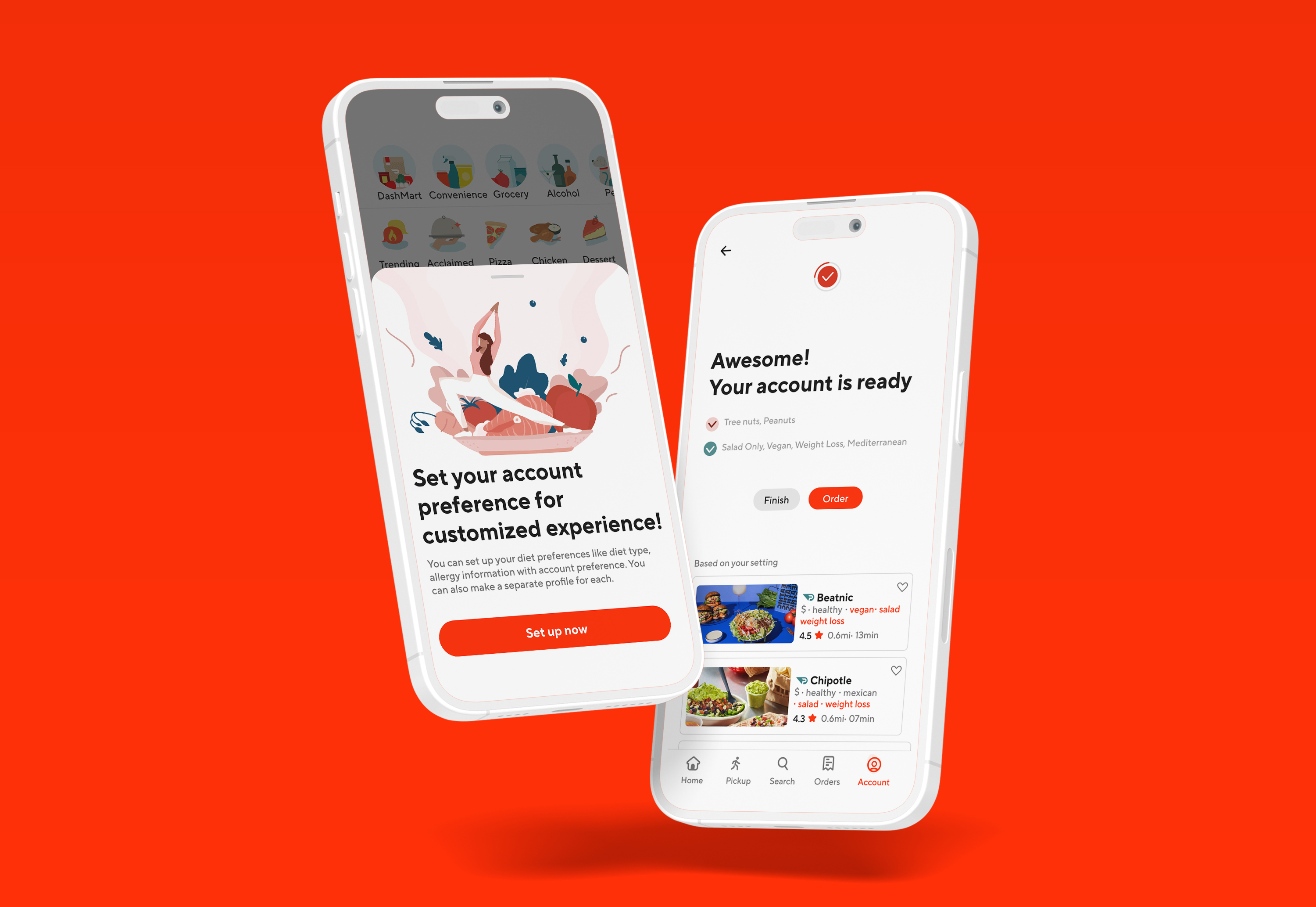
Add personalized settings with allergy, and dietary restrictions to user account.
By setting profile, users don’t have to call or write a message directly to restaurant everytime they place an order. Also Doordash can ensure restaurant about the users condition, and provide a safer experience.

( Account flow )
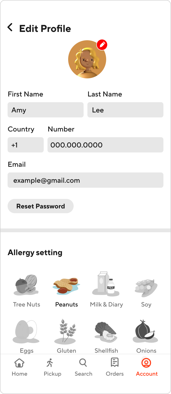
Through current ‘Account’ tab, users can access accounts page and they can edit their preferences along with current menus in ‘Account’ tab.
To integrate the dietary and allergy preference setting into DoorDash’s app, I decided to place it within the existing 'Account' tab in the user profile settings. After testing multiple wireframes, I found this approach to be the most intuitive. I included an expanded account selection page that offers a brief summary of the user’s dietary and allergy preference status, allowing for easy updates and visibility without disrupting the current flow.



( Challenge )
How can we provide seampless account setting experience?
According to Google Identity website, user drop-off rate for account setting can be as high as 80%. We want this process be as informative as possible but also quick at the same time.
( Onboarding Stage 01)
Education
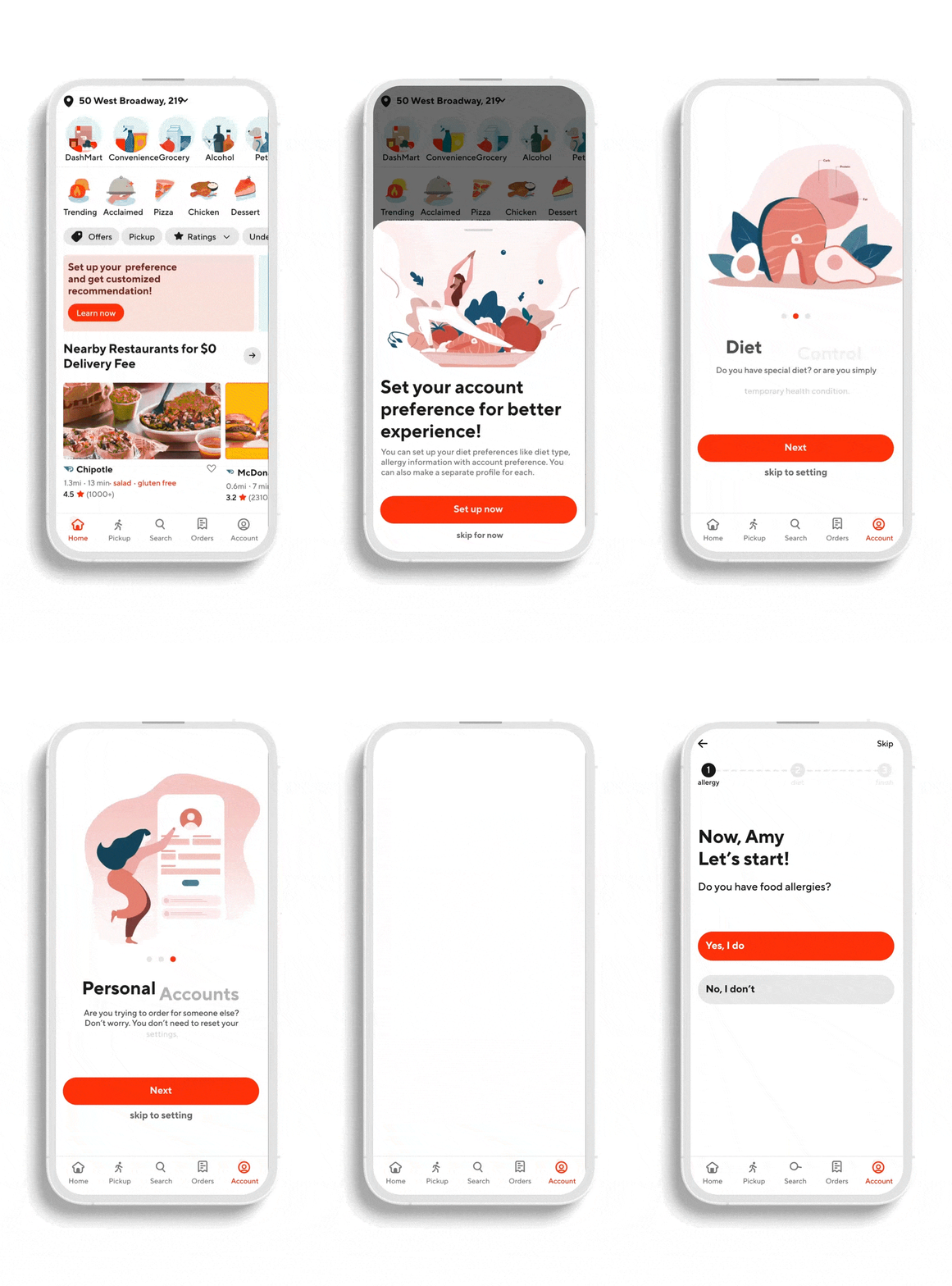
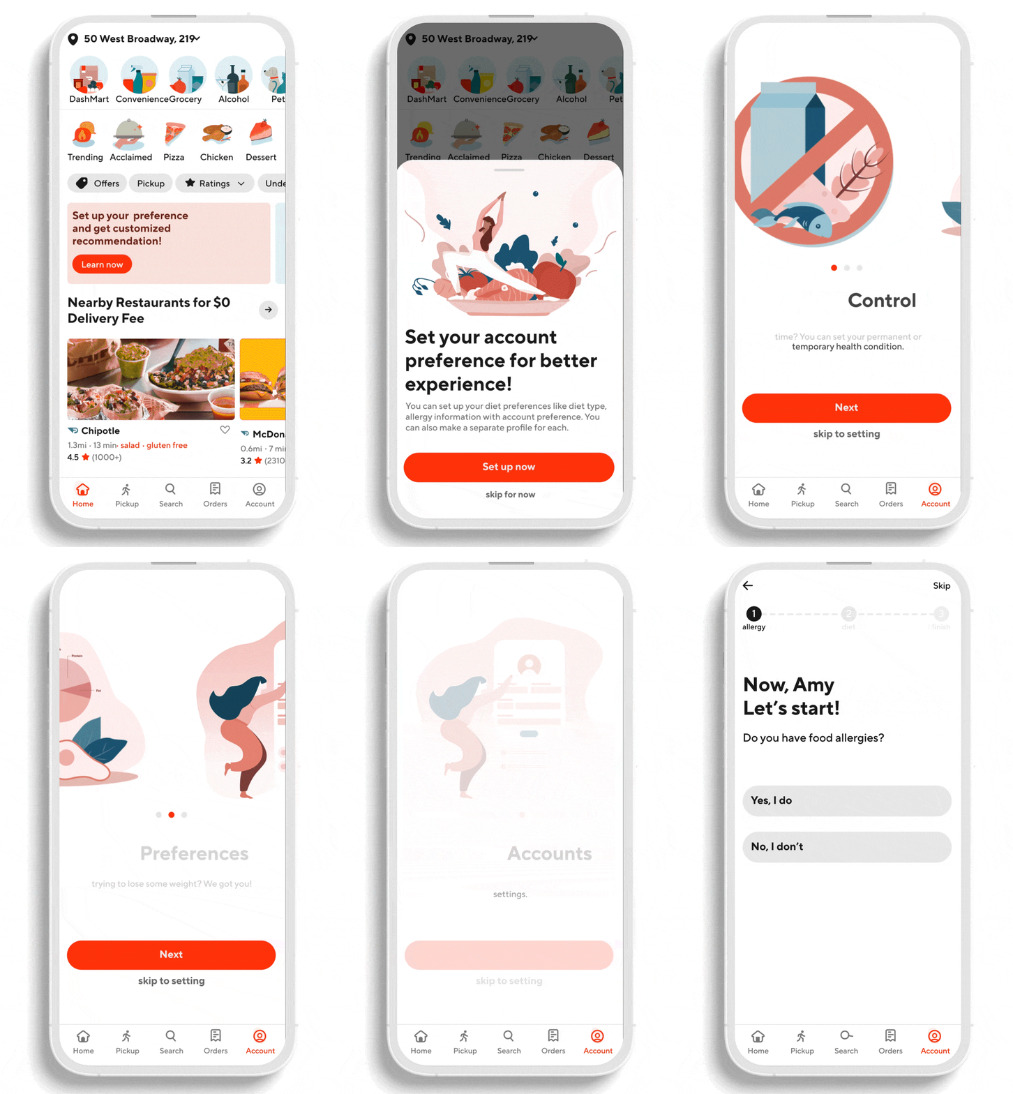
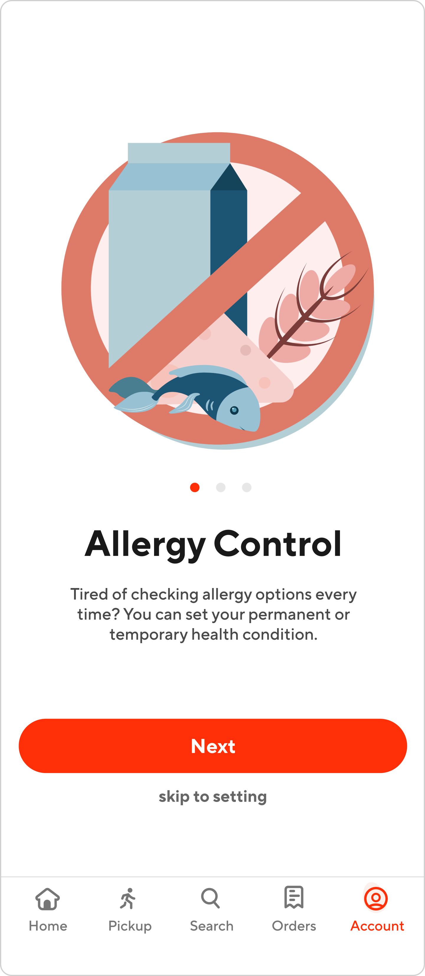
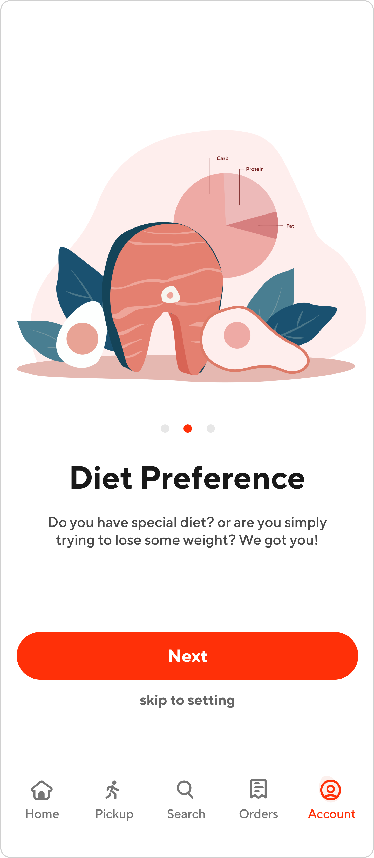
First in order to launch this feature, we want to educate user about this. Along with illustration we start this process with informative education.



( Onboarding Stage 02)
Two-steps questionnaire
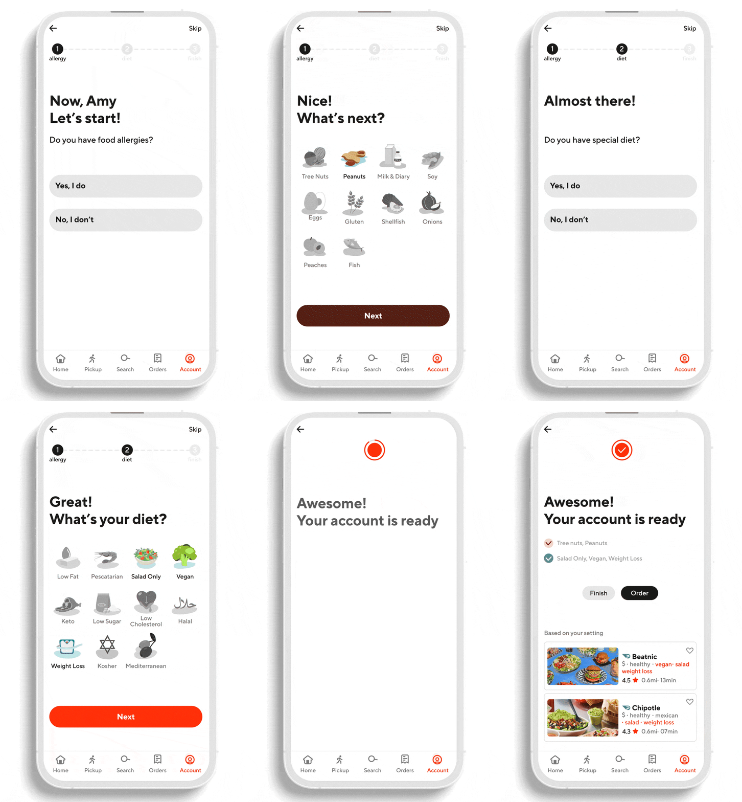
After quick education, users will be able to set account. Users will go through quick two-steps questionnaire. This takes approximately less than 30seconds to finish entire process.
