The Cell
PROJECT TYPE: TYPE,POSTER,ZINE
ROLE: ART DIRECTION,DESIGN
INSTITUTION: SVA DESIGN CLASS
ROLE: ART DIRECTION,DESIGN
INSTITUTION: SVA DESIGN CLASS
CHALLENGE
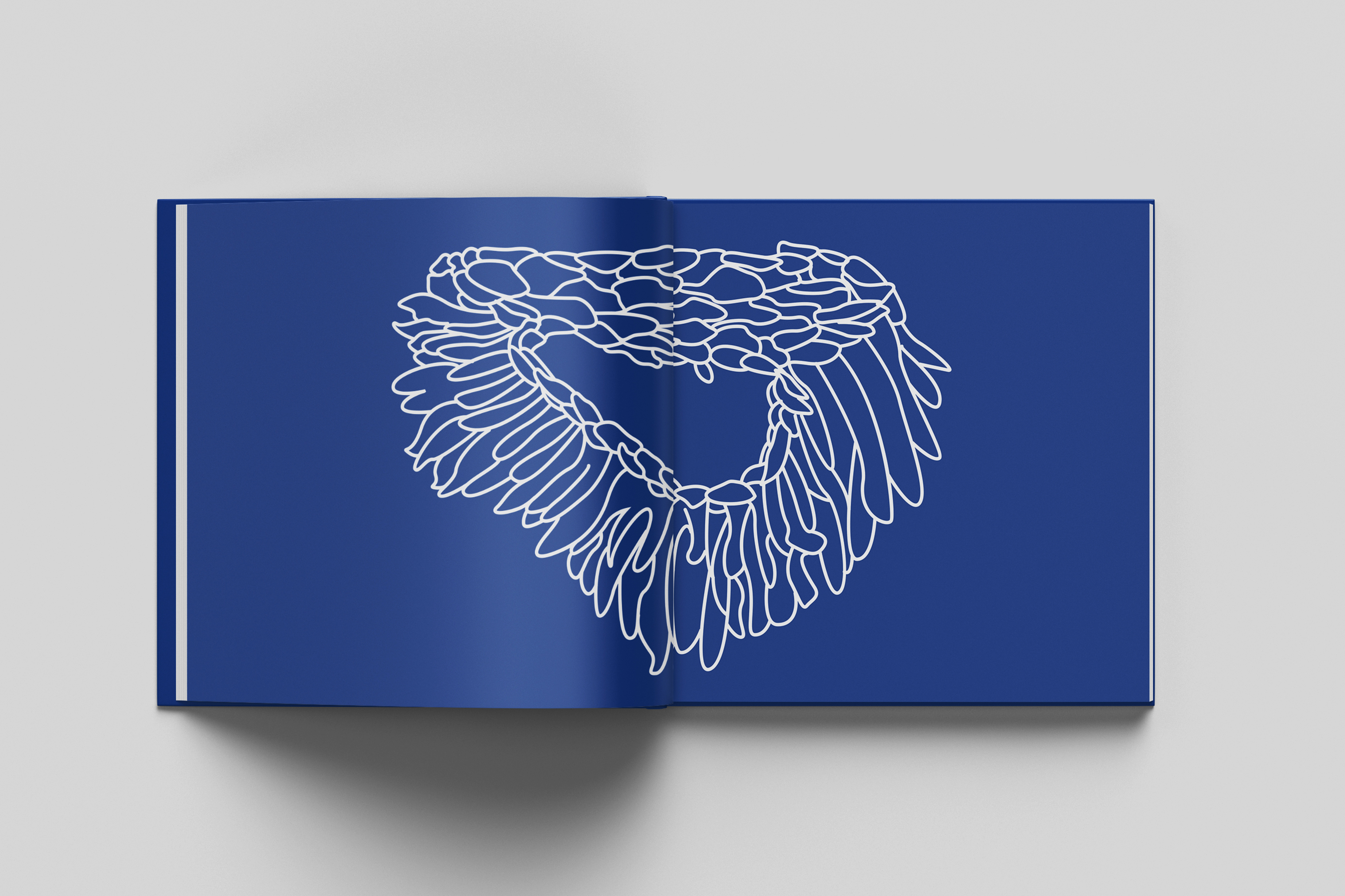
One of the major hurdles I faced during this project was achieving a balanced weight distribution among all the letters of the alphabet. It was essential to ensure there were no awkward spacing issues for legibility.
INTRO
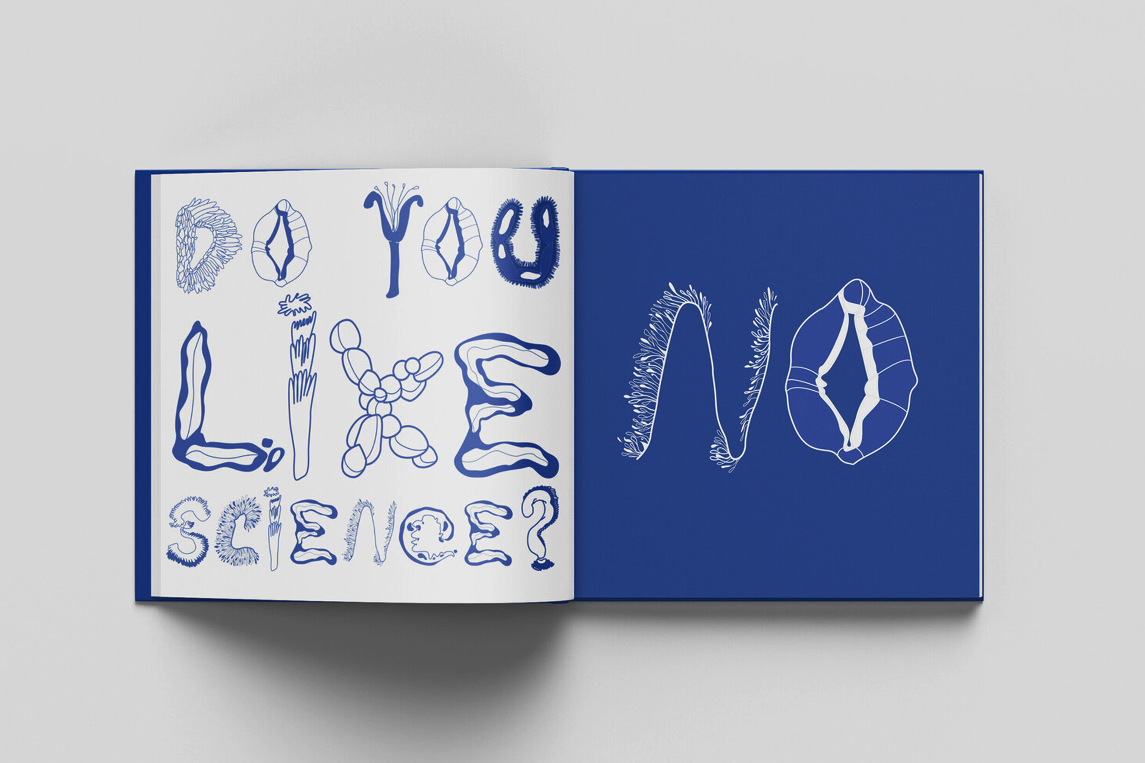
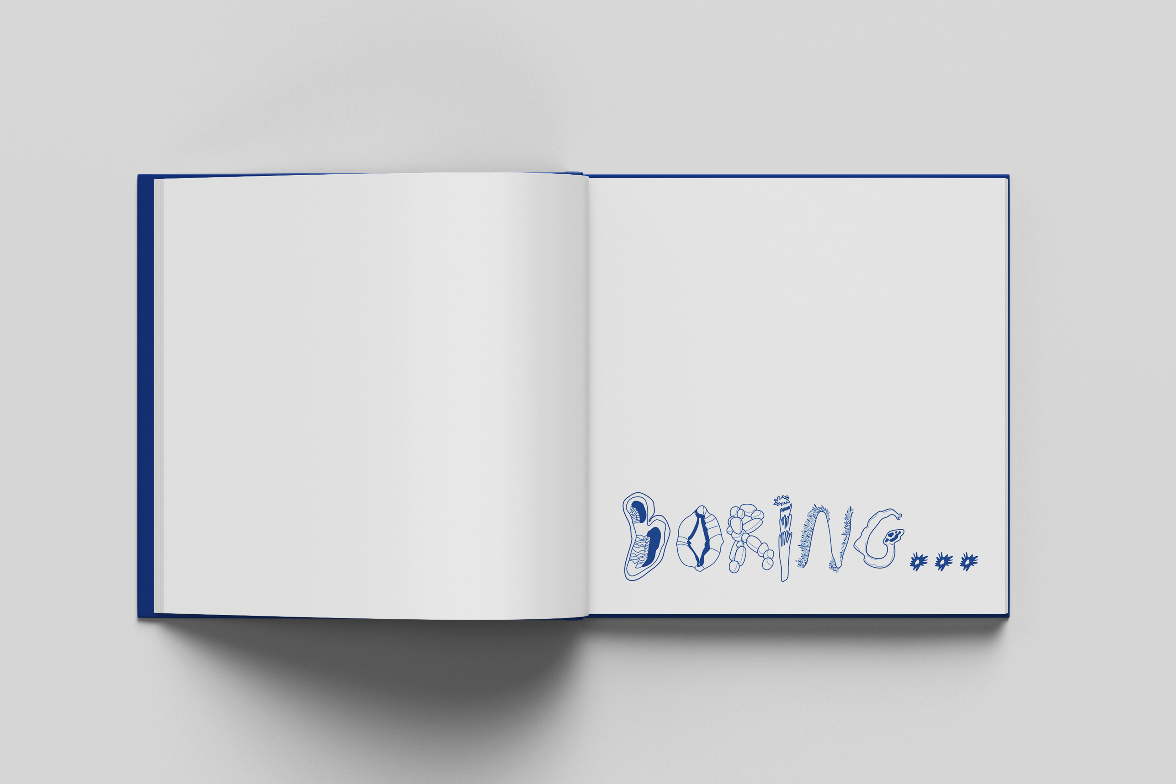
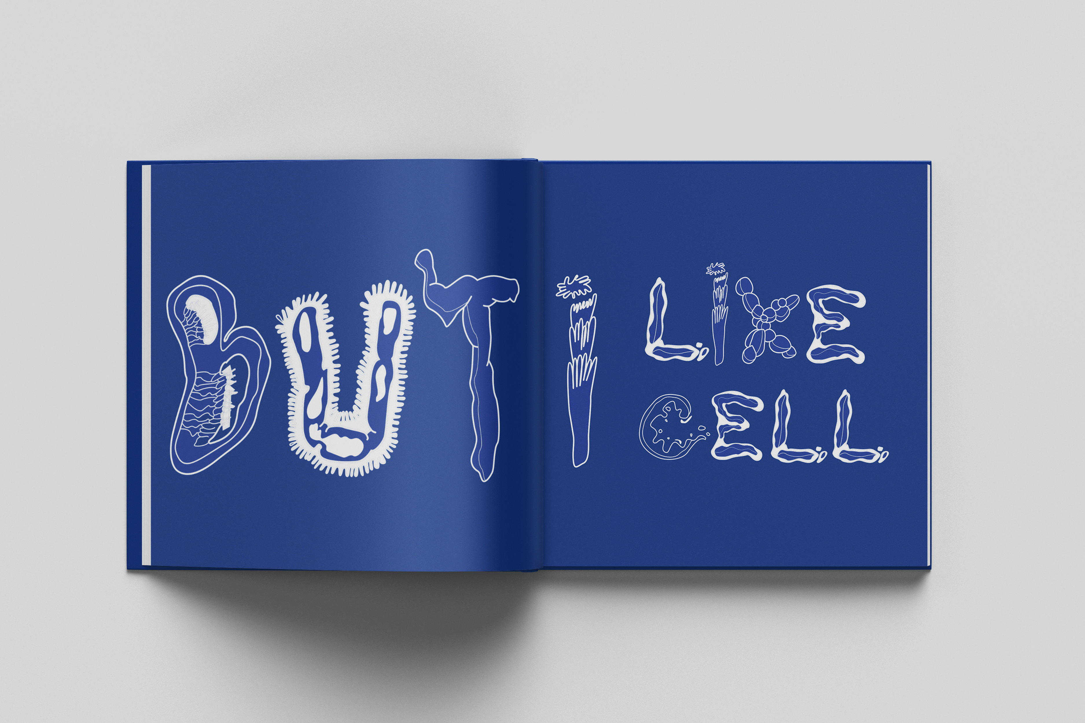
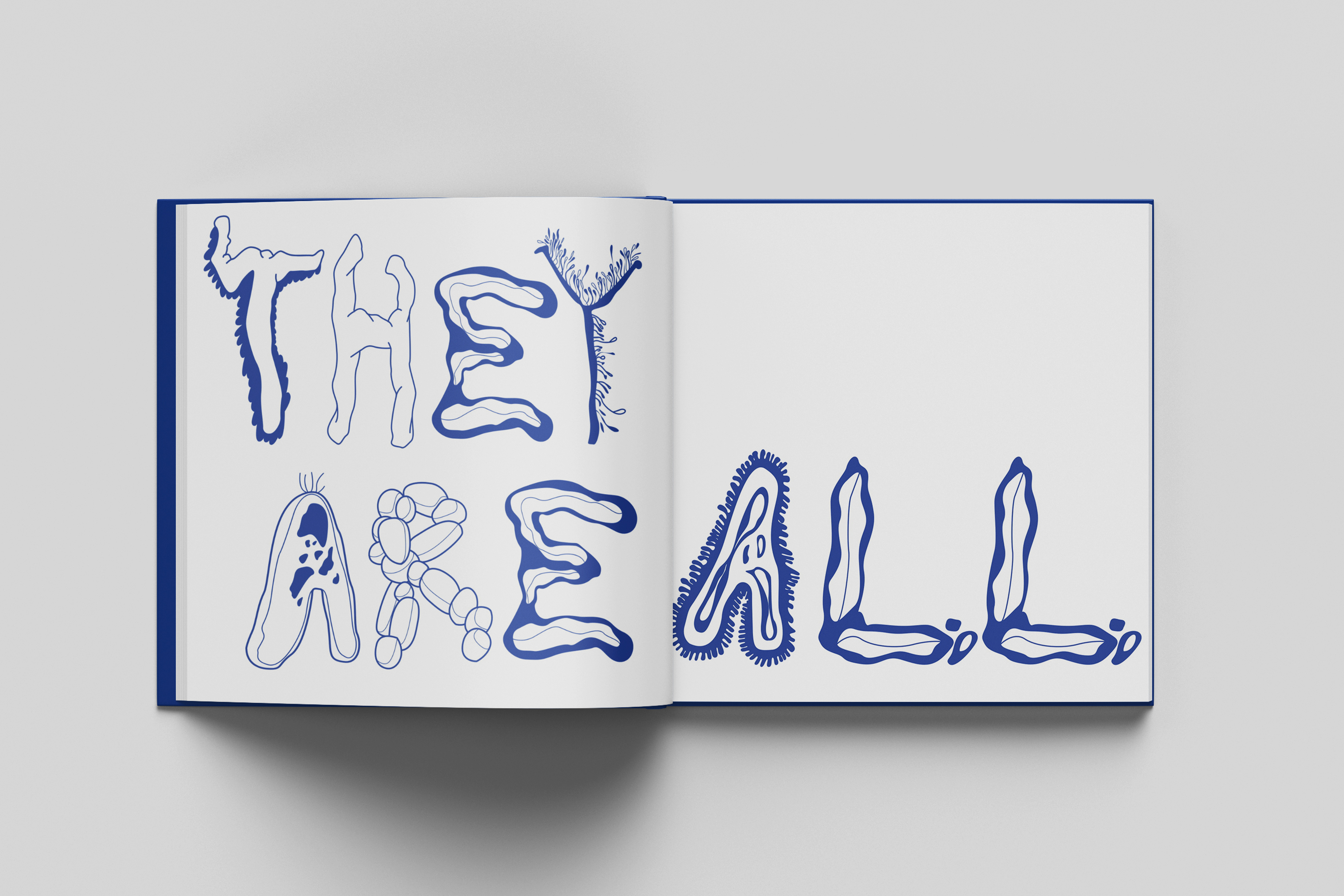
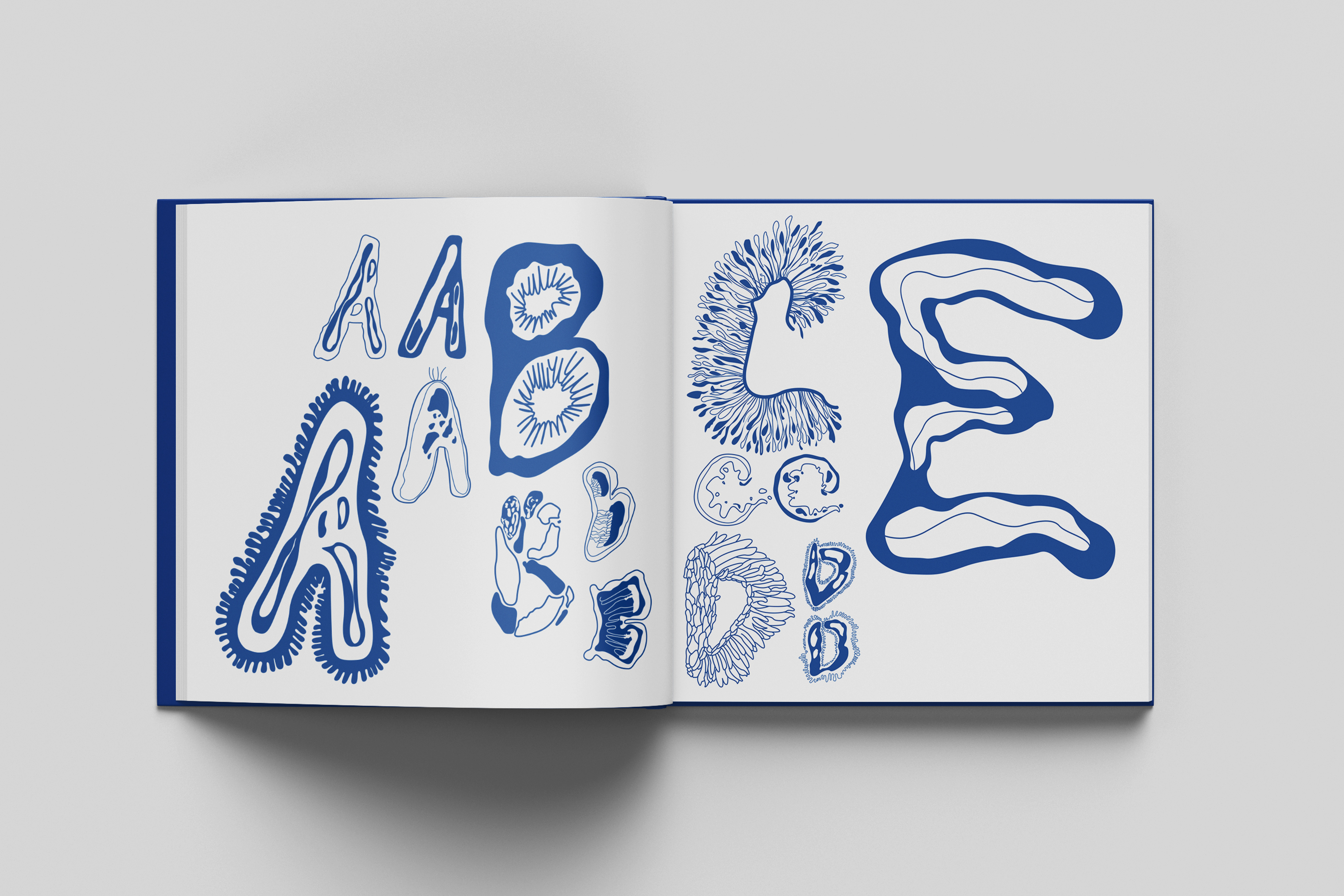
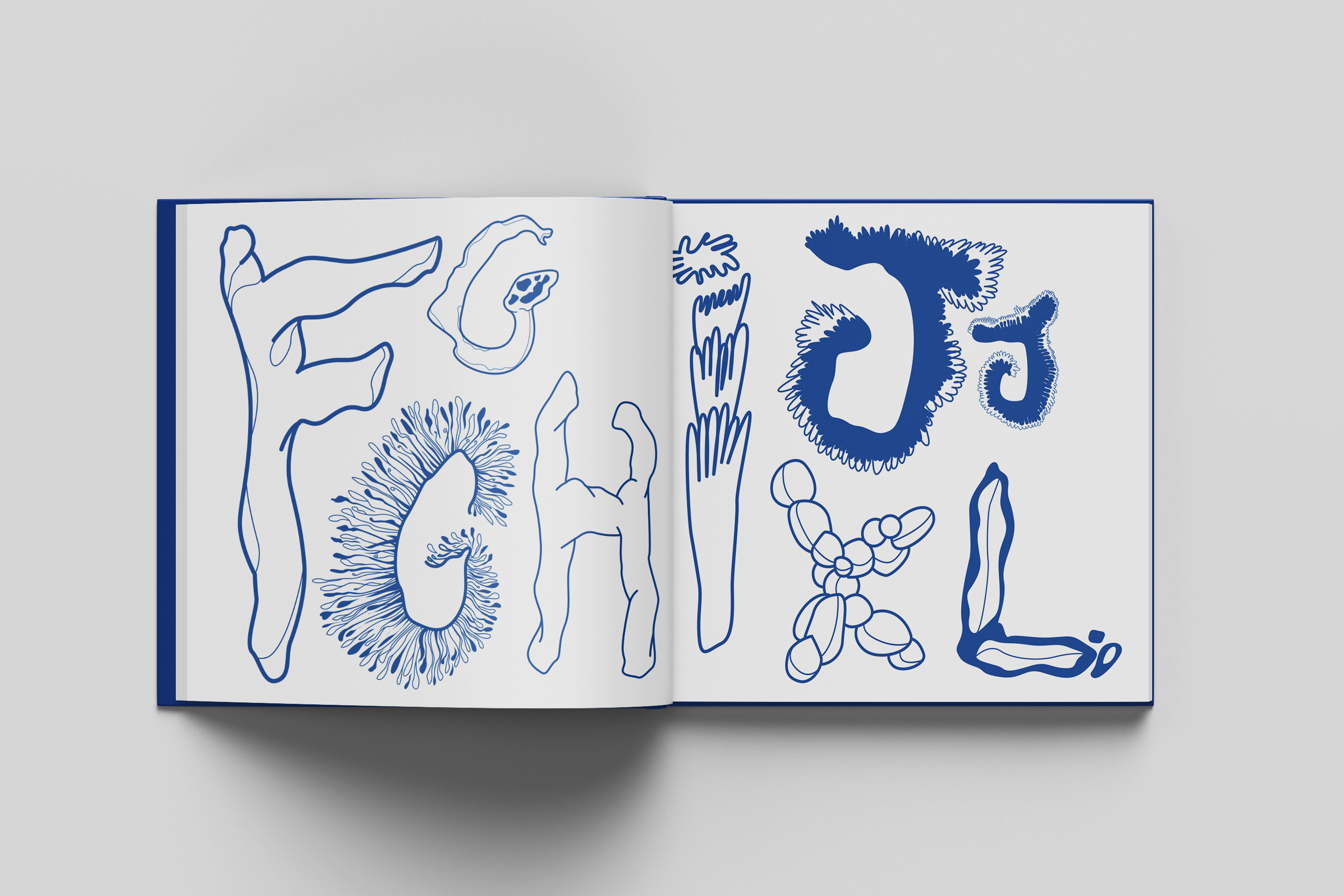
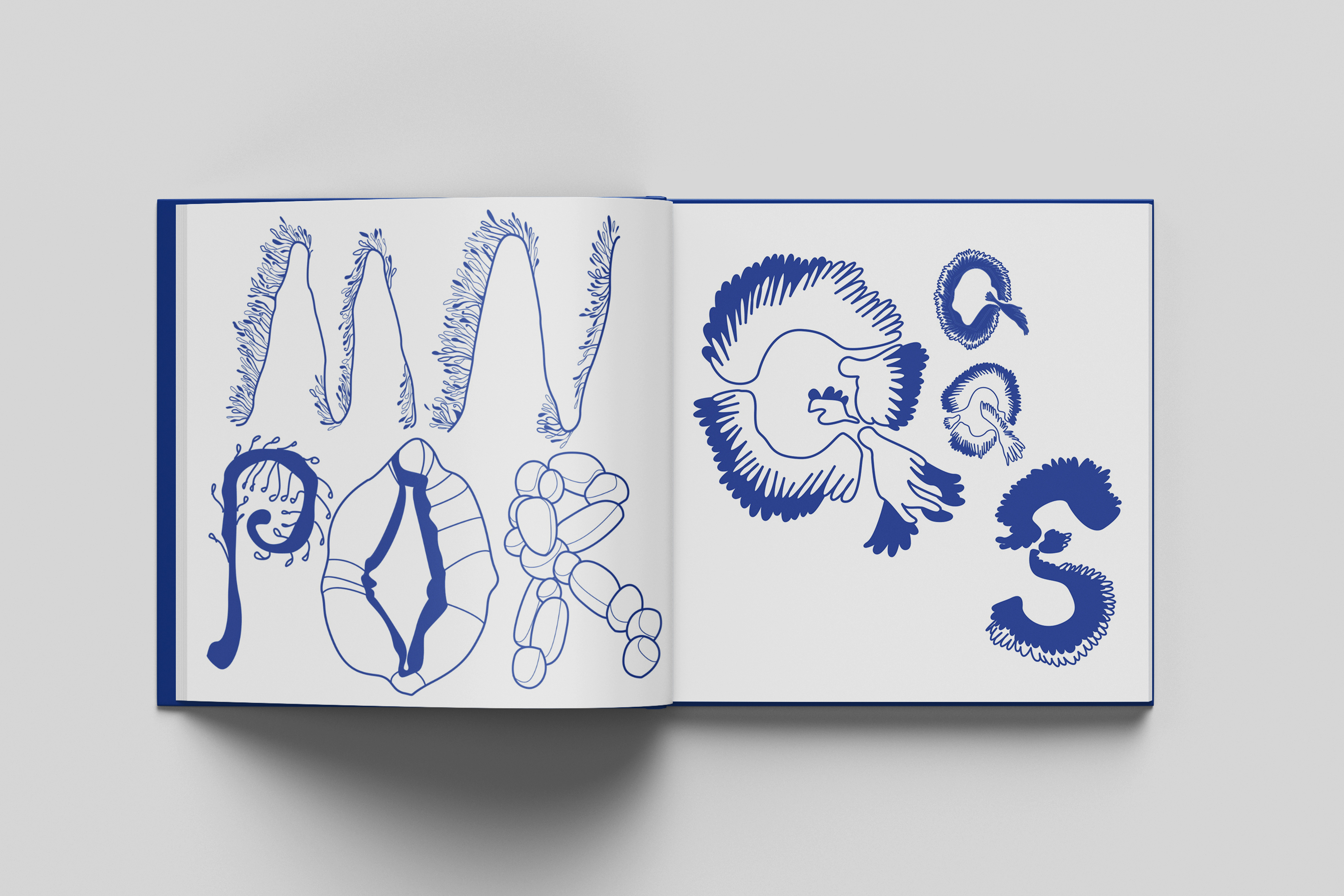
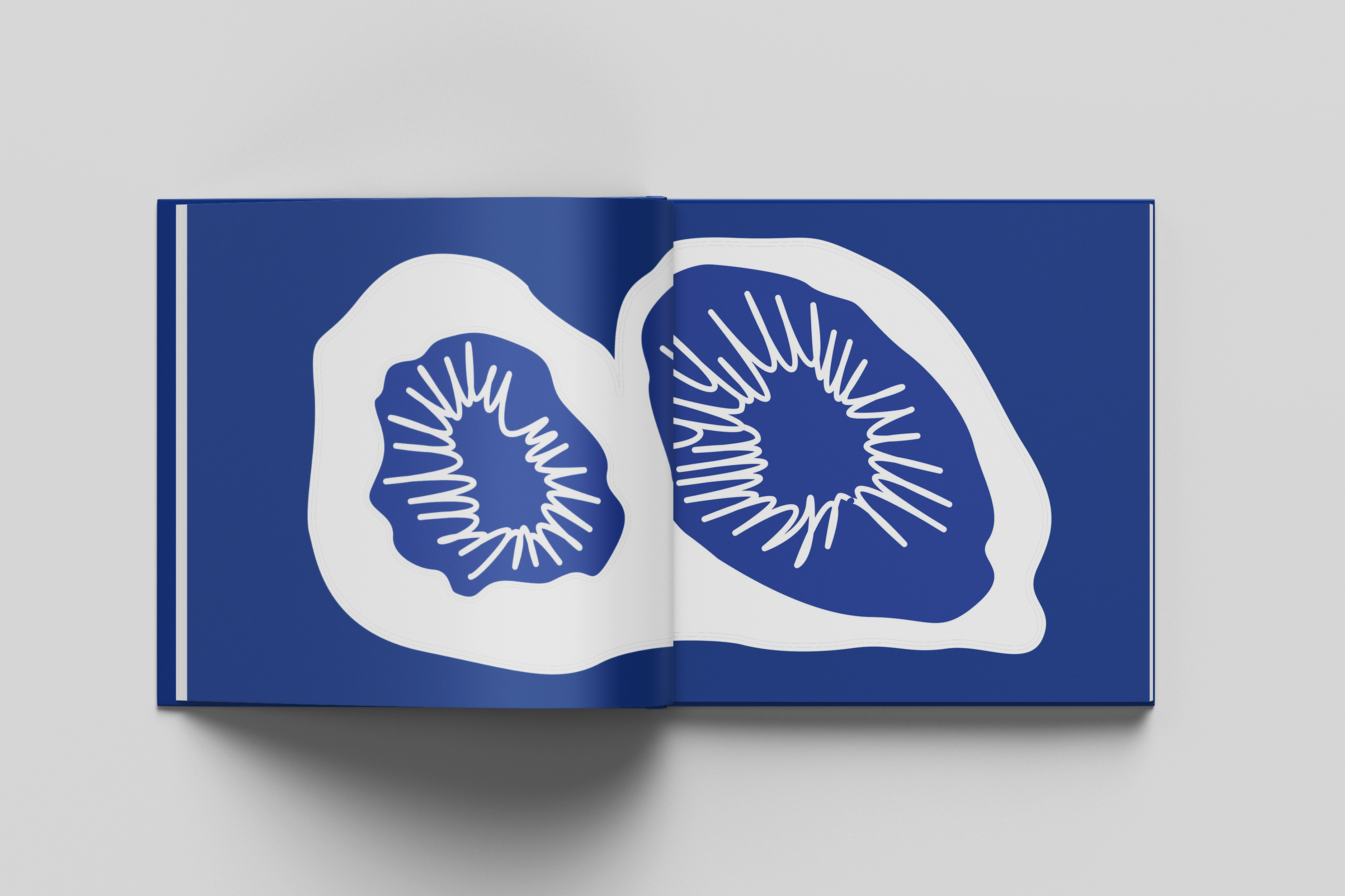
Science is often perceived as dull or unattractive, but I've discovered several similarities between art and science. Have you ever had the chance to observe microscope cell photos taken in a laboratory? They are truly inspiring.
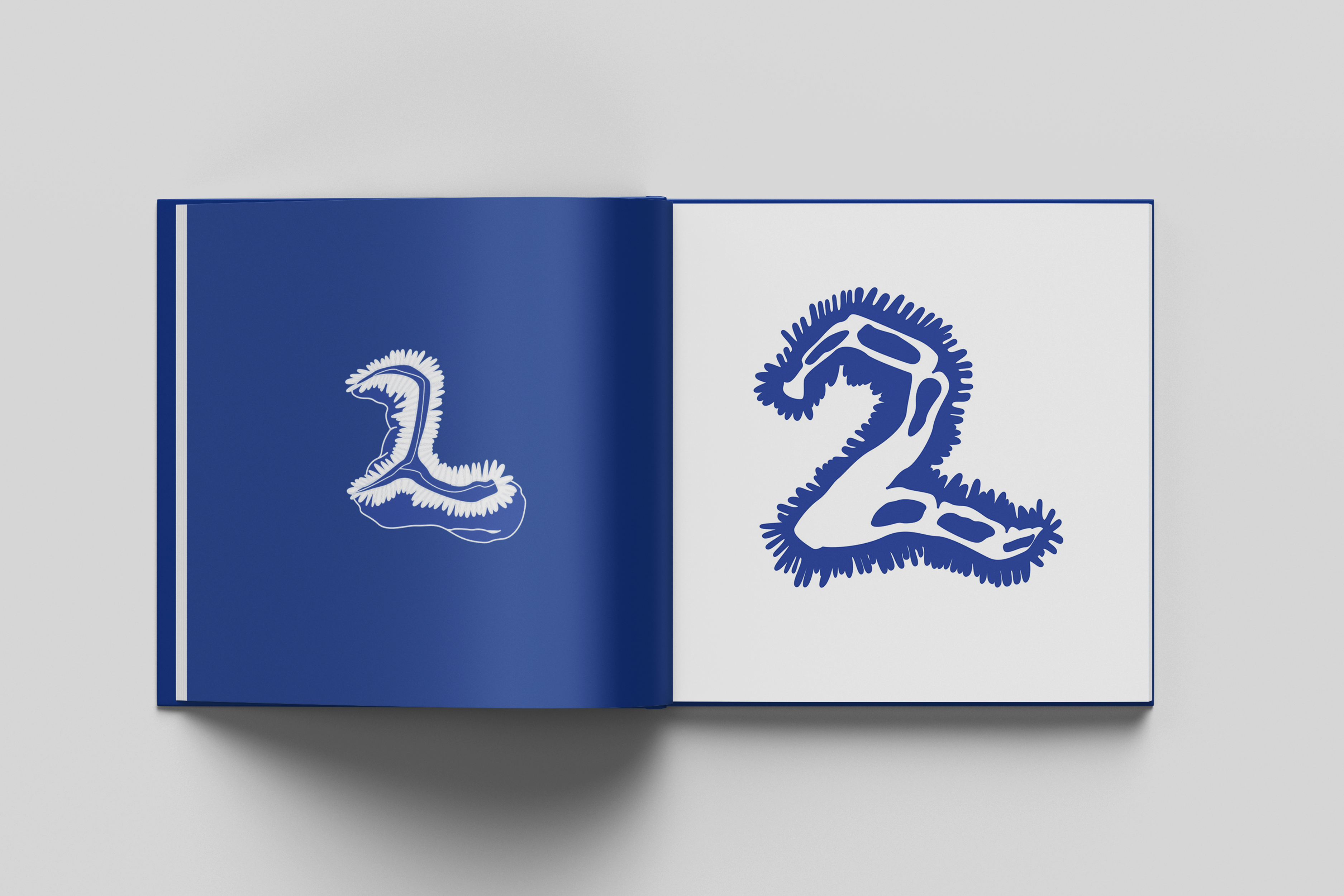
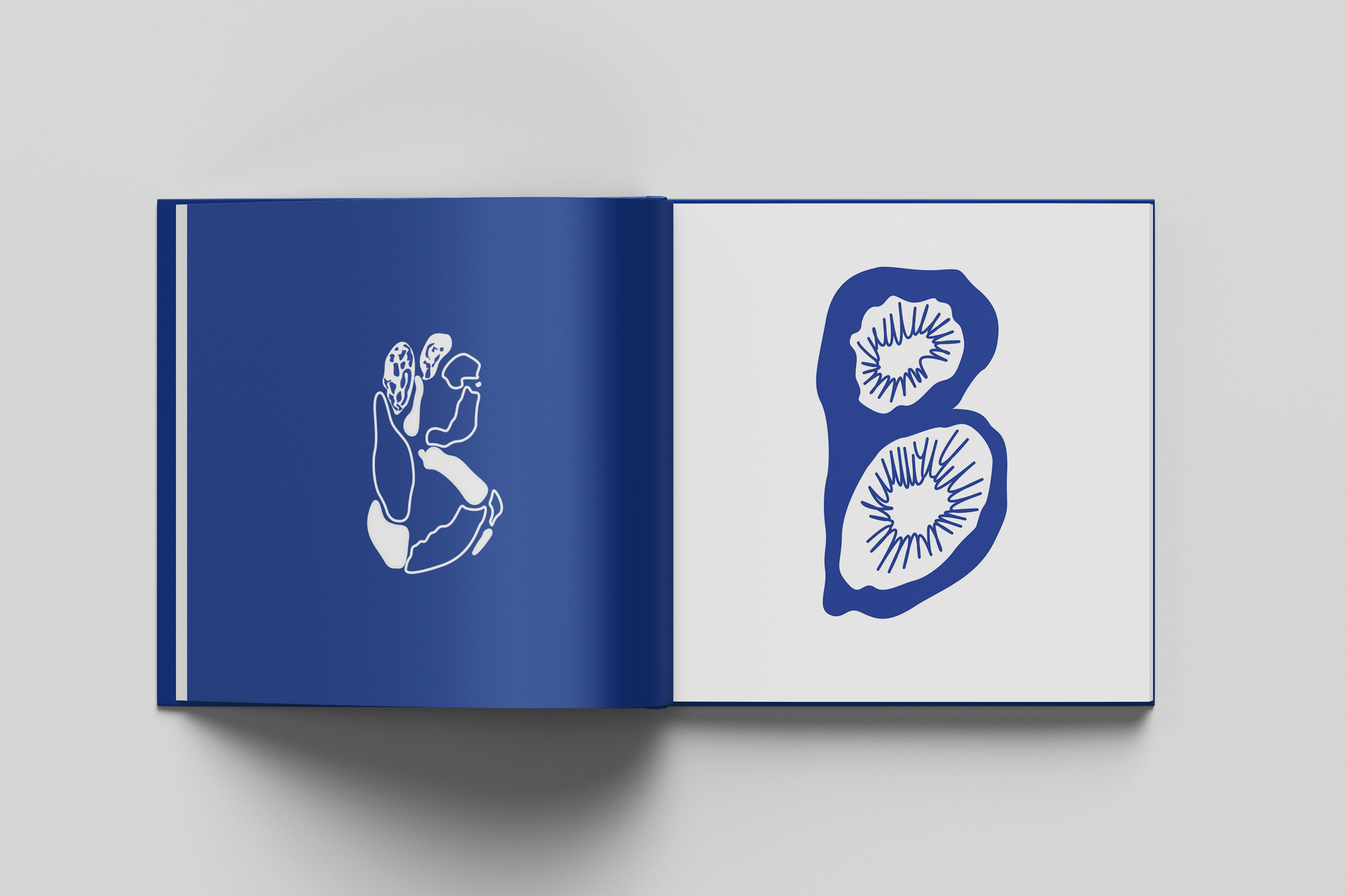
The general concept was Inspired by the organic features and intricate lines found in those photos, I decided to incorporate them into the design of the alphabet.
LOOKUPS
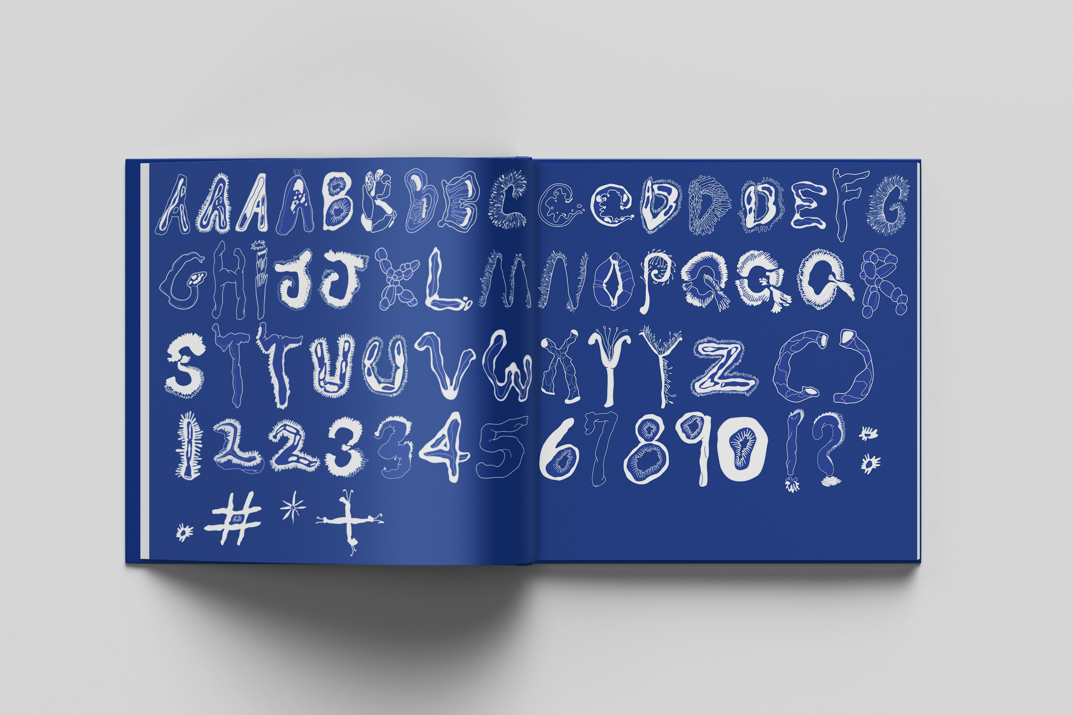
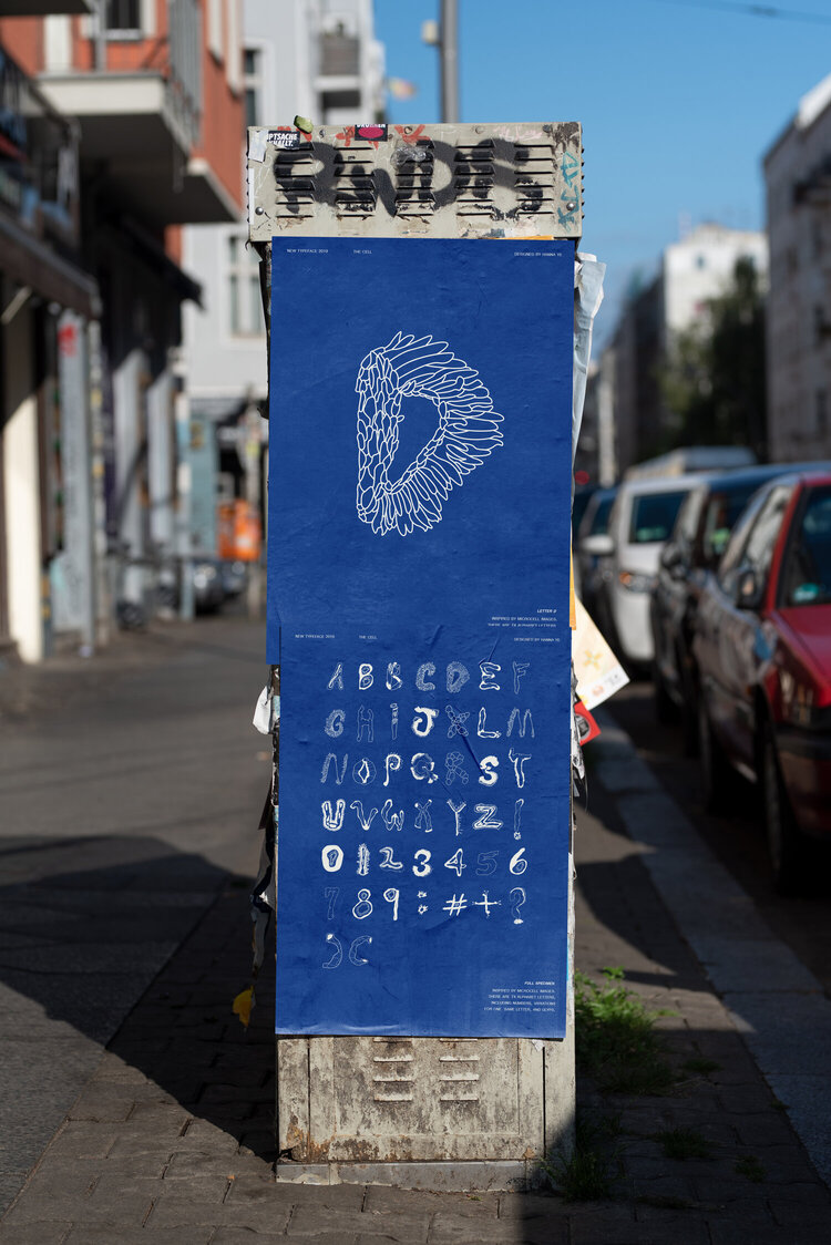
"The Cell" includes 64 characters: 41 alphabets (including 4 variations of A and B, 3 variations of C, D, and Q, 2 variations of J, T, U, and Y), 12 numbers (including 2 variations of 2 and 3), and 9 punctuation marks.
The reason that I designed different variant was because of the balance in paragraph. Since the type concept originates from organic nature, certain letters with heavier weight or axis may not be ideal to be paired with certain alphabets in the pharagraph.
One of the major hurdles I faced during this project was achieving a balanced weight distribution among all the letters of the alphabet. It was essential to ensure there were no awkward spacing issues for legibility.
INTRO
Science is often perceived as dull or unattractive, but I've discovered several similarities between art and science. Have you ever had the chance to observe microscope cell photos taken in a laboratory? They are truly inspiring.
The general concept was Inspired by the organic features and intricate lines found in those photos, I decided to incorporate them into the design of the alphabet.
LOOKUPS
"The Cell" includes 64 characters: 41 alphabets (including 4 variations of A and B, 3 variations of C, D, and Q, 2 variations of J, T, U, and Y), 12 numbers (including 2 variations of 2 and 3), and 9 punctuation marks.
The reason that I designed different variant was because of the balance in paragraph. Since the type concept originates from organic nature, certain letters with heavier weight or axis may not be ideal to be paired with certain alphabets in the pharagraph.


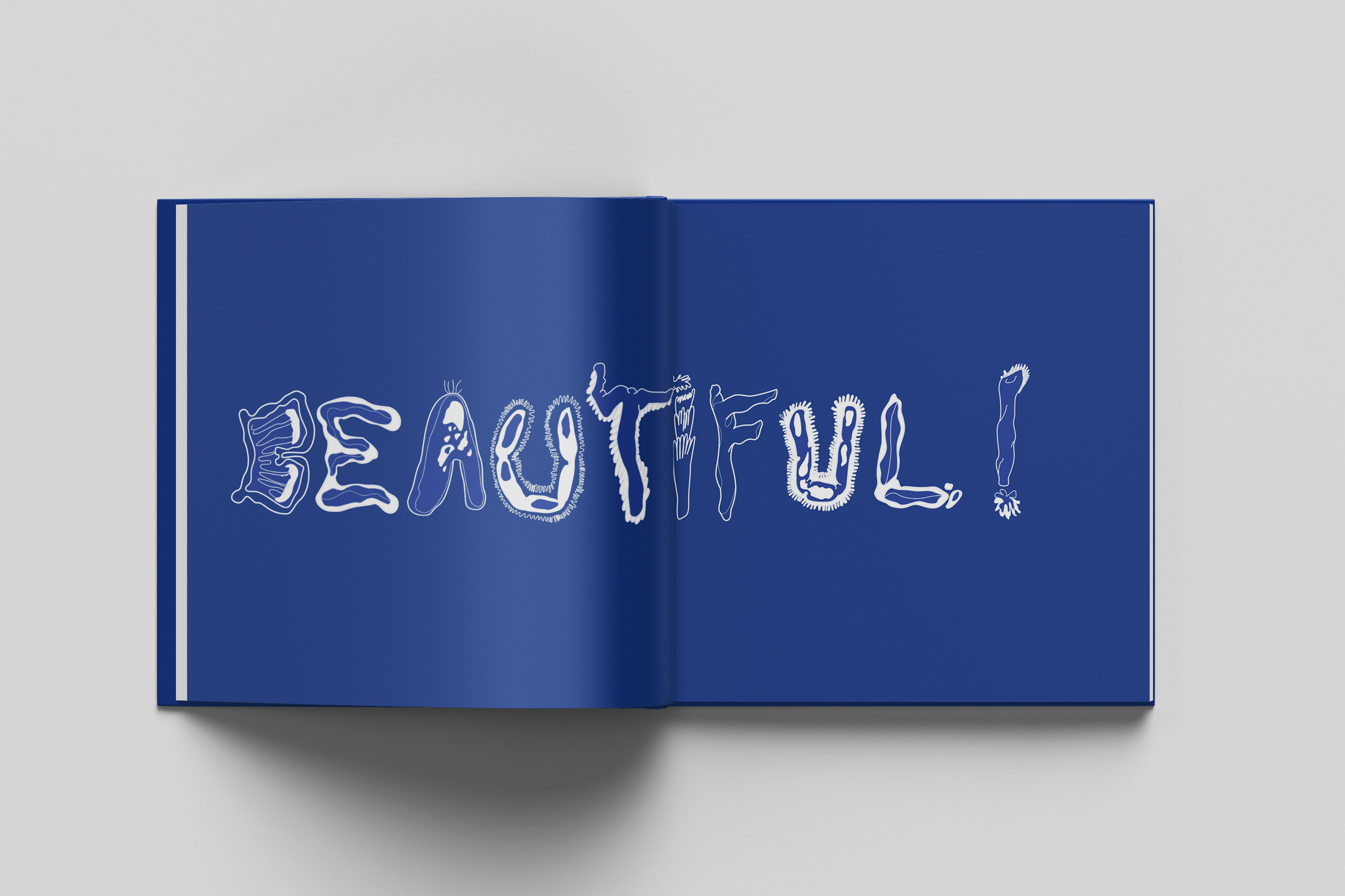
OVERALL
I was very excited when I was designing zines with this typeface. I tried many legibility test for this experimental typeface on my own and in the class. The tests were successful and I was delighted with the result. What I can improve in this project is the elements for each alphabet designs were visually inspired from microscope cell photos. Given more time, It would’ve been really nice I did deeper research to find an actual meaning instead of just getting visual references from the cells.
I was very excited when I was designing zines with this typeface. I tried many legibility test for this experimental typeface on my own and in the class. The tests were successful and I was delighted with the result. What I can improve in this project is the elements for each alphabet designs were visually inspired from microscope cell photos. Given more time, It would’ve been really nice I did deeper research to find an actual meaning instead of just getting visual references from the cells.